Friday, 23 October 2020

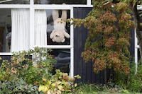
People around the world are leaving out teddy bears for children on their daily walks to spot

(Bakar, 2020)


The denoted sections in these images are that teddy bears being left outside for people to look at them when they are going to their walks during the lockdown. The images show them being outside so people can look at them being pleased with them. On looking at what has connoted the images telling a story about what life is going on with the current Cobid-19 Pandemic. When looking at the images it shows what people had been going through due to Covid-19 this is highlighted when looking at how they are placed. The meaning behind these teddy bears is to make people look at them and to bring a smile to their face when outside when they are lonely. On some of the bears, there is hygiene information to show what they should or should not do when it comes to the virus. The way they are presented is to make people wonder about what is going on.

I am affected with this work by the message the story is about it gives me sadness about what has been going due to the life we have to live under due to the current climate. When looking at the images you look at the teddy bears first due to how they have been presented to the eye this has been done as the main story for this work is to show the life of the pandemic in the time. When looking at the image it shows stories that people are trying to highlight with the life that they are currently living under. The stories are at times on some of these bears are shown below or a link to find out more about them, the bears are placed out to make young children happy. When looking at the images together it fills me with happiness that we are coming together at a time of great problems with the lockdown that was in place when this story was written. The ideas that I am planning on talking from this body of work is how they have shown the teddy bears to the viewer, I am going to take on the style of how it has all been presented to the eye.  

The work is significant to my project because I am planning on making stickman my desirable object and when looking at the images it shows emotion to highlight the problem of the virus. I am planning on taking forward how the toys are placed in the centre so it can be looked at quickly when people are scrolling through social media. The work is important to highlight the time of the lockdown.

The strengths of the work are that it shows what people got up to during lockdown, the main strength is that is they all link together when it came to the message of hope with the bears. The thing I will do differently is not using bears but stick man and use different locations, the weakness when downloading them is the resolution is not the best that is all I think is the problem due to the fact they could not go out as often.

The original article was aimed at parents with young children to try and get them to take part in this scavenger like hunt when it came to looking for the bears. The work is important to the time as it relates to the virus and how we had to change, the work is also important as a morale booster when we are all locked inside and with nothing to do. The work will hold in time as lockdown 1 has been a challenge for many and people will look back at the time forced to stay inside to prevent people from dying.

The only place I have looked at the images has been online with the context from it showing what happened before. This will work in a newspaper as it is from the Metro and this means it will be in print, the difference is going to be how the images are placed so the viewer can get the most out of the article without losing track. I think they would work in an online gallery not a physical one as young children will not enjoy it as much as they will want to find the bear themselves. This would work as a map with the location to take part in a covid secure scavenger hunt to find the bears outside, thus allowing them to get outside and not be in the way and likely give others the virus.

References

Bakar, F., 2020. People around the world are leaving out teddy bears for children on their daily walks to spot. [Online] 
[Accessed 23 10 2020]

Project Proposal: The desirable Object


Project Proposal: The desirable Object

Stick Man

Concept

The Concept for the project is to focus on the toys from Julia Donaldson’s books The Gruffalo and Stick man, the toys are simple but the catch the imagination of many people across the world. The toys will be photographed at home, on location and the studio. I am planning on photographing the toys. Some of the toys will be photographed to look funny and comedic. The toys will be done to look like an advert for the toys, this will be done using branding from the books and using similar typefaces to make them stronger. The demographic is going to be parents and their children with the factor being the books are aimed at young children. The work will be made to show the popularity of the books and the toy in the run-up to Christmas.

Methodologies

When it comes to the Methodologies the location of this shoot will be done at home, at university and on the move thus allowing more flexibility if we go into another Lockdown in the future this projects can be covered on the future. The work will be done with no help due to the virus and this is project will make the advert stand out for the viewer.

Intended Publication/ Audience

The intended audience for the project is going to be young children as I am going to be using the Gruffalo and the stick man character with the book being aimed at young children. The outcome is to make the work look like an elf on the self-styled campaign. This will allow me to take advantage of any Covid lockdown or forced self-isolation `by the government. The work will all be published on my social media feeds and website.

Equipment Used

The equipment that I am going to be using is a Nikon D3400 with a 35mm with this being the equipment that I have available. I will be using a light meter at home when it arrives on the w/c 26/10 this will allow me to get a decent amount of ambient lighting in my bedroom. When looking at syncing my camera to Lightroom it will not work as my camera is not supported to be tethered so I will be going with the Nikon based app and the back of the camera and review it regularly by manually importing the images.

Skills

The Skills that I am going to need to improve when it comes to this project is how to shoot in dark ambient light when it comes to the object due to the fact that I do not have any studio equipment at home. I am also going to try and make sure that stick man is in the right place and can be photographed on a lower ISO than it might be required. I am going to try and tether my camera by using Nikon’s Capture and view applications for my camera as Lightroom does not support my camera.

Writers 

The writer that I am going to be researching is Julia Donaldson, as she is the author the project is going to be based around when it comes to stick man. I am going to be using her as the main subject and focusing on how she has used the guy and how I could model him to make it link to her book and how it could be changed given the current Covid restrictions.

Monday, 13 April 2020

ICP: Studio Test 1


Annotations - Bigwight High vis & Apex Tools


Walker Evans: The beauty of the Common Tool

Walker Evans: The beauty of the Common Tool


What is denoted & Connoted?

The work denotes large tools placed in the centre of the frame and showing huge power. The tools are all presented to look bland but showing detail of the tools showing what they are all about but making them come together. The meaning behind the tools is designed to show that the Pound-land value tools can also look beautiful when being presented and this works for the viewers. The work communicates as basic tools are positioned in a certain way the use of the captions shows the tools in the correct size with the tools official name and the price that it will cost you from the shop at the time of the shoot.

How are you affected as a viewer?

When looking at the work you will automatically look at the oversized tools due to the way the work has been positioned to the viewer. The tools do not make me happy or sad when looking at it normal viewpoint as they are dull and boring as this does not stand out to the viewer normally.

What makes this work significant to the project?

The work is significant to the project as I am planning on using the underlying theme that the tools all have all been presented in a way that they all look dull and boring to the eye. The background has been done to be basic with the tools not coming together to make it look interesting to the eye and that is what he had set out to work on. I like the composition of how the tools are with them all being placed in a vertical aspect ratio with them all being central with what I think he was trying to do is to make the tools look boring.

The text from the tools

Among low-priced, factory-produced goods, none is so ap­pealing to the senses as the ordinary hand tool. Hence, a hardware store is a kind of offbeat museum show for the man who responds to good, clear “undesired” forms. The Swedish steel pliers pictured above, with their somehow swanlike flow, and the objects on the following pages, in all their tough simplicity, illustrate this. Aside from their func­tions-though, they are exclusively wedded to function ­each of these tools lures the eye to follow its curves and angles, and invites the hand to test its balance.

Who would sully the lines of the tin-cutting shears on page 105 with a single added bend or whorl? Or clothe in any, way the fine naked impression of heft and bite in the crescent wrench on page 107? To be sure, some design-happy manufacturers have tampered with certain tool classics; the beautiful plumb bob, which used to come naively and solemnly shaped like a child’s top, now looks suspiciously like a toy space ship and is no longer brassy. But not much can be done to spoil a crate opener, that nobly ferocious state­ment in black steel, as may be seen on page 104. In fact, almost all the basic small tools stand, aesthetically speaking, for elegance, candour, and purity. -W.E...

My View Point on the text

My Viewpoint the text is that it criticises the way people will look at tools and how the manufacturers are wanting to make the tools look sexy to the viewer. The ideology from the tools is that we need to make them interesting and beautiful and the way he has presented the tools. The way he has produced the work is designed to make the tools look boring to put it as F you to the viewer to get to understand the meaning of boring tools. I think the text tells all your need to know to show them together.

What ideas (or visual styles) will you take forward to think about in your work? 

The visual styles that I am planning on taking forward are the way the tools have been presented to the viewers by adding colour to the background for the tools and the high vis jacket. The use of keeping the formatting together they work to stand out. I am not going to keep the boring background but make it stylish for this to stand out to the viewer. My work will be different from this work so I will use the setup and make it fun and contemporary.

Who is the intended audience? 

 The intended audience was for readers of the Frieze magazine and was Evans’s trying to put a middle finger to the fancy commercial industry. The tools are not designed to have the contemporary feel that the work has shown is at is designed to make the tools look boring and basic to make the viewer look at it. 

What context have you seen the work in? 

The context in that I have seen this in is in the essay by David Campany in print and online, and the tools from the internet. The tools are designed to go in a magazine as it has been mentioned before. The tools are shown to be boring and tactile so the viewer might go out and purchase the tools to match it all up so it can stand out and it would make an interesting reaction to the viewer, this would only work at the original size when it was published in the magazine.

Strength’s & Weakness

The strengths of the work have been done to show the tools being big and powerful to the viewer. The work shows the power that you can get from the tools with it being overpowered. The weaknesses of this do not stand out to the viewer in a positive way as they look boring and they do not have any colour which does not have the themes and it allows me to stand out the idea to showing it all. 


Project Proposal

Project Proposal 

Assignment: Out in the World &  Title: Beauty of the High Vis Jacket, Beauty Of The Common Tool revisited


The concept behind the project is based on David Campany’s essay on “Out in the World: Still Life Photography between Art and Commerce.” 

I am planning on taking on the simple idea of turning the unfashionable high vis jacket and turning it into the object that has got flare and it is designed for it to stand out with the diffuser. The objects that are going to be around the side is going to be based around the idea that Walker Evans created in 1955. The idea will be to take the work of the ‘Beauties of the Common Tool’ by using pillars that I have got at home. I am planning on using them to be designed to be for a working-class advert to the middle class with elegance. Unlike how Walker Evans made his work I am planning to turn my work with colour and make the tools be silhouettes so it will stand out to the members of the public at home. 

Mentioned in the essay is how “This is less nostalgia than a sign of how hard it is to develop an artistic relation to the very new. ‘Design just a little dated will interest any artist. Design current is always terrible. Anyone who has tried to find a good contemporary lamp or clock will know what I mean.”. 

I am planning on trying to contradict the statement and take something that it is seen to be contemporary and turn it around to make the current image to look decent. I don’t want to make my work look like it is from the past as it will make the work look terrible and this means I want to try and make it something look different to the viewer. 

“All of which is Art with a capital ‘A’, all of it keen to distance itself from the still life as Commerce (capital ‘C’), even though commerce is often the subject matter.” I am planning on making the work come together and make art come together will the idea of commerce to make the viewer understand how we are simple, and it comes together. This allows me to understand how I can use the simple lighting set up and turn it into something that nobody has made the work that I am planning on producing.  I make my work be a social statement and advertisement to stand out and sell the idea of High vis jacket. Context, as any photographer will tell you, is key.   

I am wanting to highlight how we overlook the humble high vis jacket and make it all look plain and boring. I want to make a statement to say that a humble high vis jacket can look good in any way shape and form when you come to present it. I am also planning on photographing the tools against the diffuser to see what the impact it will have on my work with it done to be simulated to Walker Evans’s tools to highlight the change that we are seeing in life. 


 All of this Section has got direct quotes and paraphrased references from the Essay By David Company (CAMPANY, 2011)

Methodologies 

 I am planning on shooting this project in the Daphne Oram studio Do1.08 with it being done to look formal but have a loving texture and feeling to the jacket. In the frame is going to be a high vis jacket that I will place on a light stand with a coat hanger to make it look formal with a glare to the viewer at home. I will also be placing tools around the diffuser to make it look interesting and be inspired by Walker Evans.  The work will not have any ethical implications once completed due to the fact I am not making a political statement with the high vis jacket. The only ethical implication is that if I am stopped and search they will assume the worst when it comes to the use or the tools that I am photographing. The main specific research that I will need to undertake is the essay by David Campany about in the world. 

Intended Publication/ Audience 

The indented audience is to be done for a gallery or fashion magazine setting when it comes to the high vis jacket to highlight what my jacket has done and to make it stand out to the viewer.   I am also planning on producing two versions a 10x8 version, for example, to be used for a gallery set up and square format image for the images to stand out when uploading to Instagram. Some of the images that I am planning on using will be edited to expand them to square to allow them to stand out. The format will be achieved by expanding the canvas with the crop tool and with the use of the content-aware tool it allows me to keep the tool the same but allows me to show more information to the viewer on Instagram.


Equipment Used
The lighting equipment is going to be 3 Bowen Gemini lights, with two lights placed around the back to give the background the glow and light with an umbrella to place some light on the jacket just enough for it to stand out. I will also be using a light diffuser for my background as it will be able to make the work look contemporary and interesting. The camera I am planning on using is a cannon EOS 60D & 70D this be borrowed from the university. I will also be using a light trigger with a light meter to highlight what needed to be done. The digital equipment will be used with Adobe Lightroom, Bridge, Photoshop.

Writers 

The writers that I am going to be researching is David Campany with the work being based around his essay on Out in the world. This is going to be the main influence when it comes to scholars and writers. 

Friday, 20 December 2019

About Pieter Hugo


Born on Friday 29th October 1976 and is 43 years old, He was born in the city of Johannesburg, South Africa. Pieter Hugo is a self-taught photographer when he picked up his fathers at the age of 10, on his 12th birthday in 1988 he got given a camera and made him become curious. With the First image that Hugo, printed was homeless men with his work being ‘p’oltical with showing the problems of the world (O’Hagan, 2008).  


-->
His 1st projects that Hugo worked on was by attending a political rally to understand what is going on with South Africa with him investigating his own curiosity. One of his first serious undertakings was capturing the aftermath of the riots that followed the 1993 assassination of ANC leader Chris Hani (Montgomery, 2011). Hugo works as a contemporary artist in South Africa whose projects have addressed “issues of class, identity, violence, and privilege (ArtNet, 2019)” This has been done when he has documented people who have been marginalized and downtrodden in parts of Africa. The regions include South-Africa, Rwanda and Nigeria with the subjects being Hyena tamers, albinos and children who survived the Rwandan Genocide in 1994 with it being a project of Portraits of Reconciliation.

Hugo’s, authorship “fuelled by his awareness of vestigial Apartheid—his white privilege providing him with the ability to produce contemporary photography, while prohibiting him from ever accessing the experience of black Africans. (ArtNet, 2019)” This is important to understand that he wants to photograph what he once to advantage of and not having to be part of the negativity surrounding his subjects. He wants all of his photos that he has worked to be made public.

Hugo uses a medium format and large format camera with the use of the chromatic palette has made his photos have a hyper-realistic factor with huge definition, by the use of having a harsh studio lighting.  The way his prints come out it has been described of seeing ourselves as, John Berger has spoken about before, through awkward situations that he has done though we are complicit as a viewer. Like Bruce Gildon, it is about focusing on people’s defects, imperfections with race playing a factor here. When people look at some of his work it sheds our masks in what we see in life. (GLAVIANO, 2013)
Figure 7 The hyena & other men (2007)
The way Pieter Hugo has gone around working the road trip he normally starts with a theme when before he starts is by drawing inspiration from over photographs. Hugo normally photographs his subjects over “over two-week stretches” He shoots over this time period when on the road so “I can keep my eye fresh” as over the time you can lose all meaning with what is going as Hugo learned when working on Rwanda with him being “desensitized and acclimatized” to the problematic situations. In 2009 Hugo, shot Permeant Error this done on over
“two trips of two weeks each” in order for Hugo, to clear his head. In 2008 Hugo, worked on Nollywood and this was shot on 4 trips
All direct quotes and paragraph from (Ruhkamp, 2018, pp. 3,10):

When Hugo was working on Rwanda 1994 he used the road trip with painstaking effort to make sure that he could get to sides of the coin when it comes to nature where it is all beautiful and calm while negative things can happen. The locations were in remote villages of South Africa and Rwanda the locations were hidden from most people apart from the people who understand the locations. This sanctioned the photographers to be raw with having a crystal-clear meaning of the location, where at times “something beautiful and innocent can sometimes come out of something terrible.” (Public Delivery, 2018)

The way that Pieter Hugo went around creating the road trip has allowed his work to stand out and become strong.


Portrait Of Kent, Canterbury Cathedral

The Portrait of Kent: Canterbury Cathedral is a social documentary portraiture series of photographs, which documents the life of the cathed...